When I arrived at El Toro as the first ever graphic designer, I was thrown right into the bullpen (all puns intended.) As a designer, I’ve always revered clean, simple, and minimal styles. My first few months were spent creating branding guidelines to ensure all of our sales materials had continuity and a sleek style. Over time, I was asked to consult on the designs for a few of our clients’ digital banner ads. I suggested cleaner fonts, co-branded landing pages, and the “simple is more” concept.
 One day, while going over some ads, I was pulled aside by one of my colleagues who gave me a piece of advice that I had never heard before: “When it comes to digital banner ads, the uglier, the better.” I laughed it off at first, walking away as if he didn’t know what he was talking about. How could an ugly digital advertisement perform better than a well designed ad? But then I began to contemplate my colleague’s statement and my perspective began to shift. That idea has solidified into the thesis of this blog post — a thesis that should make every graphic designer cringe: ugly digital banner ads can, and usually do, perform better than aesthetically pleasing banner ads.
The Background of Digital Banner Ads
To fully understand why ugly advertisements perform better, we have to go back to 2005, the “MySpace-era” of the Internet. I was really young when MySpace was the top reigning social networking site. The top-ranking song was “Hips Don’t Lie” by Shakira, the Blackberry was the ‘smartphone’ of the day, and unlimited texting had just become a thing. And in the digital advertising industry, banner ads were becoming the major player.
Banner ads were nothing new during the MySpace-era. In fact, the first clickable banner ad was introduced on Global Network Navigator in 1993. Suddenly, pandora’s box had been opened. By 1995, GNN was making close to $11,000 a week selling advertising space on the website until AOL bought them for an estimated $11 million. Soon enough, banner ads were literally shaping the Internet because standardized banner ad sizes had been introduced on the Web, enabling any site to sell ad space. It was even sometimes common to visit a website with nothing but banners around the entire site. No matter what site you visited, one would constantly see some sort of moving banner ad. One of the banners that I remember vividly read: “Shoot 3 zombies and win a free ringtone!” You could hover over the ad and suddenly your mouse became the crosshairs of a sniper rifle. What I didn’t realize at the time was the intention behind the advertisement: three clicks on the ad would trigger the landing page, which back then, was usually some sort of malicious virus downloaded on my computer (no wonder my PC ran so slow).
Over the next few years, the Internet was shaped, molded, and redesigned by companies like Google, Facebook, and Apple. With the introduction of the iPhone, mobile optimization became essential. And with Apple emerging as an industry leader, so did clean and sleek web design. The transformation was such a process that most people may not have noticed all the iterations. However, when one reviews web sites from the mid-2000’s compared to 2017, most would be surprised how dramatically things have changed. Suddenly, design became a crucial part of an online brand, and banner advertisements followed the herd.
The Proof
So, by now you’re probably asking, “What does the design history of the Internet have to do with ugly banner ads performing better?” The answer is simple: clean digital banner ads can be lost within the content of a clean and beautifully designed webpage. The way your advertisement will stand out is if it’s loud, a tad bit ugly like 2005, and has a clear and concise message.
These days, it’s actually pretty rare for someone to click on a digital banner ad. Here at El Toro, we don’t measure our campaign results solely on CTR (Click-Through Rate) — they’re primarily evaluated by our Matchback Analysis. However, if you’re a company looking for a high CTR , uglier is the way to go. There are facts to support this argument. A few years ago, ChristianMingle.com ran a digital banner advertisement campaign. One ad was designed cleanly and simply, while the other had a boxy look with a tilted message. The results? The ugly ad performed better:
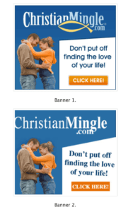
Designed Ad: 11,388 impressions, 79 clicks, 0.07% CTR
Ugly Ad: 13,437 impressions, 147 clicks, 0.11% CTR
Another theory as to why ugly banner ads perform better is that they seem more authentic and personal. Advertisements are mainly administered by companies, which we can sniff out easily. But when the ad is a bit clunky and imperfect, we perceive it to be “for us” because it was made by someone “like us.”
How Should My Banner Ads Look?
Now, I’m not saying I enjoy the idea of ugly banner advertisements. In fact, I actually hate it. The reality is ugly sells on the Internet. I do believe there is a fine line between a well designed banner ad and one that is just a tad bit ugly. When designing your digital banner ads, think about how it will look on a webpage. Is the advertisement going to blend in? Will people even see the advertisement? Perhaps just a slight tilt of the text is enough to grab someone’s attention. You never want to sacrifice your brand for the idea of ugly; but the evidence would submit that there is a happy median.